Easy Gradient Palettes

Gradient palettes are an invaluable asset in UI design, offering a streamlined way to select a color—or more precisely, a hue—and its lighter or darker variations. Though it may seem straightforward in theory, in reality crafting gradient palettes is quite complex and poses significant challenges due to the complexity of the matter.
That's why we have developed a user-friendly and free tool that simplifies the creation of gradient palettes by integrating modern browser technologies.
Check out our Oklch Palette Generator here.
For those eager to dive into the specifics, this article has you covered. However, here's a brief overview of what our Palette Generator offers:
- The ability to input one or more colors, generating a gradient that incorporates them seamlessly.
- Assurance of consistent gradients, where colors of different gradients have the same lightness level, allowing for reliable color substitution and guaranteed contrast.
- Utilization of Oklch to achieve uniform gradients, capitalizing on Oklch's consistent lightness feature. This adaptability means it can also leverage all colors within the capabilities of modern displays.
- Export options, enabling you to seamlessly integrate these colors into your CSS files, JavaScript configurations, or Figma projects.
In essence, our tool seeks to streamline the creation of gradient palettes, making it an effortless task for designers to achieve the perfect color blend for their projects.
The Challenge of Crafting Gradient Palettes
Color theory can be tricky, especially when it comes to gradients. Before the
advent of
HSL, there
wasn't a straightforward method to generate gradients. Take, for example, a blue
shade represented by the HEX code #3cacf7. This code signifies the RGB (Red,
Green, Blue) values of a color, with numbers ranging from 0 (00) to 255
(ff). The higher the number, the more intense the color. So, black is when all
values are 00, and white is when they're all ff.
Now, here's the puzzle: it's incredibly hard to figure out how to modify
#3cacf7 to make it lighter or darker without losing its original feel.
Essentially, without affecting its hue and saturation in a way that looks
natural and balanced.
With the debut of CSS3 in 2010 came a new function to define colors: HSL, short
for Hue, Saturation, and Lightness. This seems like the perfect solution! Take
our previous example of blue (#3cacf7) and convert it to its HSL equivalent:
hsl(204.06, 92.12%, 60.2%). The last number here refers to lightness,
suggesting that to forge a gradient, we might just need to adjust this lightness
value across a set of colors.
So, if we go ahead and generate a sequence of 12 colors based on this principle, here's how it turns out:

Not too shabby! Yet, a couple of things could be better. For instance, the difference in lightness between the lightest color and the one following it is a tad too pronounced. However, that's an easy fix.
Let's mix in a few more shades.
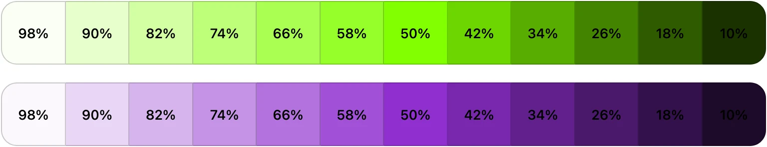
And this is where we run into a classic HSL hiccup: A green hue at 50% lightness looks markedly lighter than a purple of the same lightness percentage. Notice the legibility challenge with the "50%" text on the purple background as opposed to the green.
Another observation here: the green seems to drift ever so slightly, adopting a subtle yellow hue in its lighter variants.
These challenges often lead designers back to meticulously craft these gradients by hand-picking each color.
How Oklch Addresses Some Problems
Oklch provides a neat solution to some of the issues we faced. Unlike HSL, where adjustments in lightness don't always correspond to how we perceive color brightness, Oklch's lightness corresponds to perceived lightness. This feature ensures that if we compare two colors both set to 50% lightness in Oklch, they'll appear equally bright to our eyes.
Lch, the basis of Oklch, represents Lightness, Chroma (akin to saturation), and Hue. Oklch improves on this algorithm, preventing unwanted hue shifts when altering lightness.
Additionally, what sets Oklch apart is its use of the P3 color space. This allows you to define colors in the full range of the capabilities of contemporary displays. The result? More consistent, visually pleasing gradients across a broader range of devices.
Let's recreate the same gradients in Oklch:
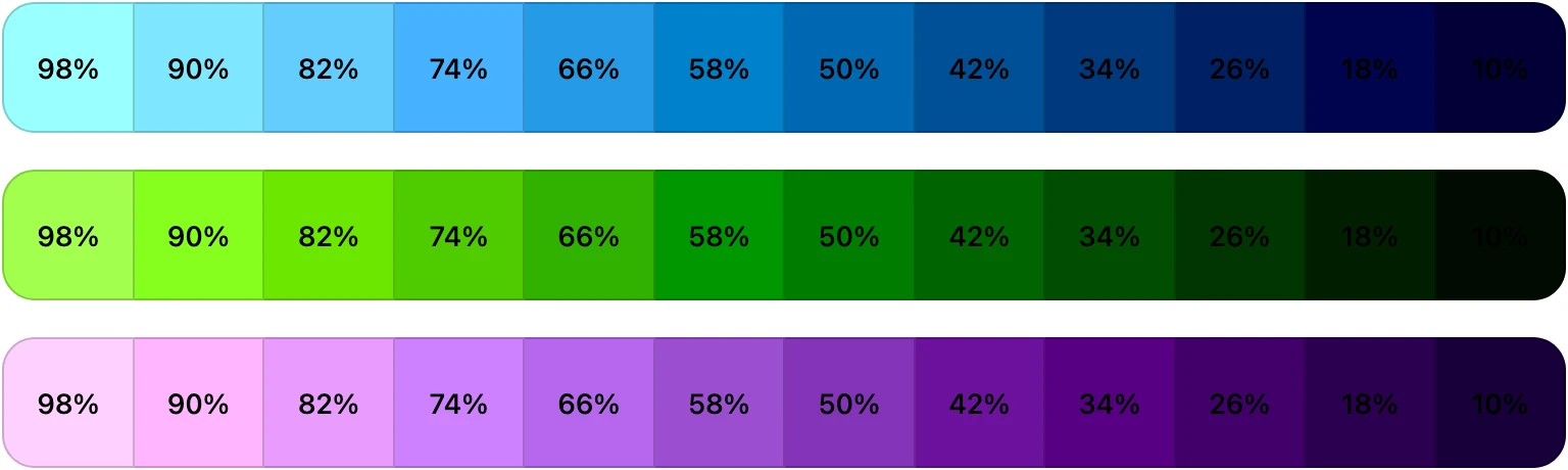
Alright, that addresses one challenge: achieving uniform lightness across colors. However, this approach leads to another problem where the lighter colors may appear overly vibrant. This situation arises because Oklch doesn't set a cap on color intensity. It permits the specification of hues that might not yet be displayable on current screens but could be on future ones.
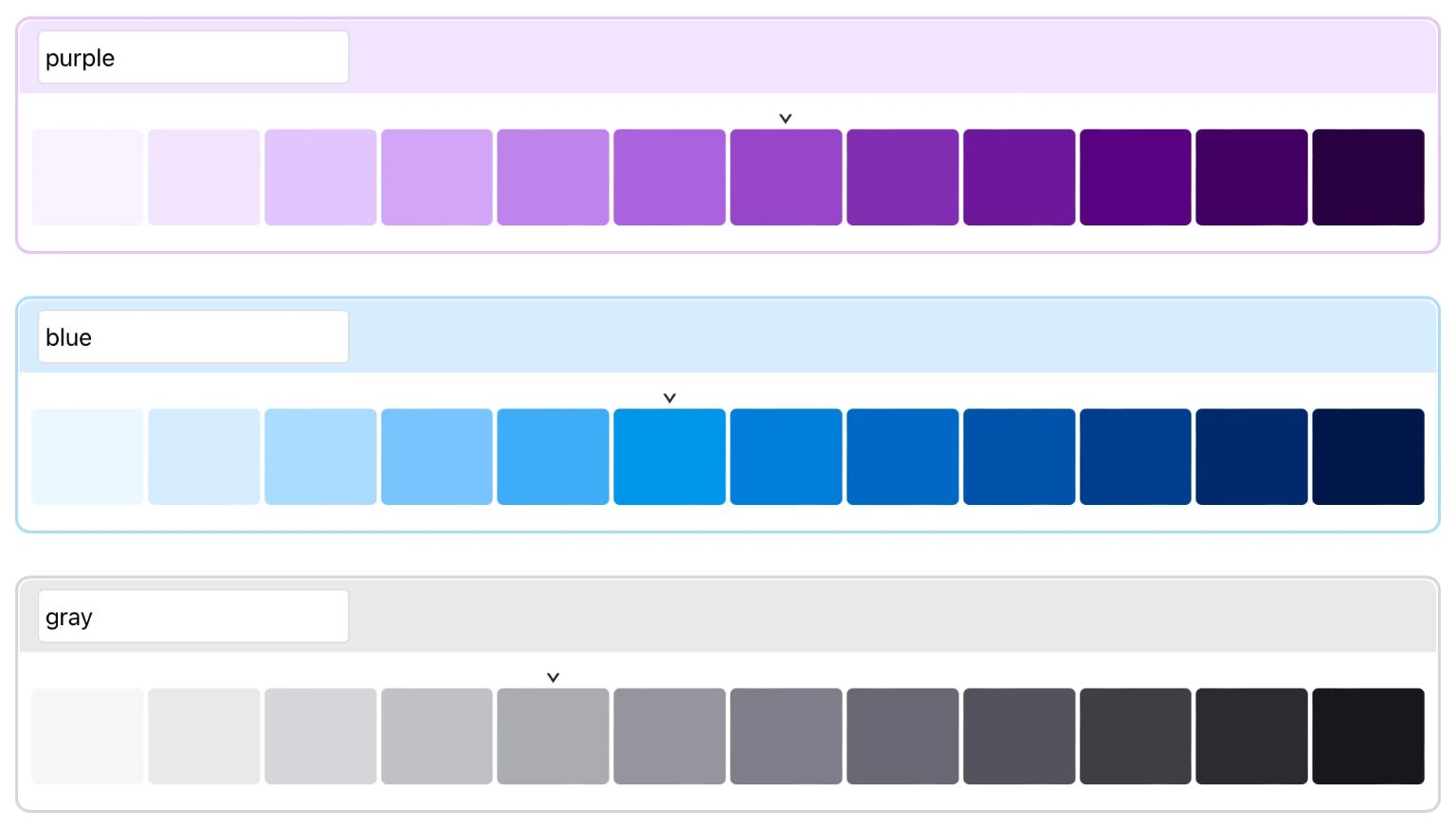
Our Solution
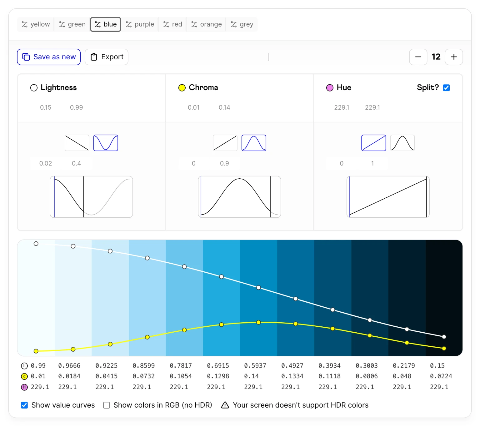
As you can see, Oklch is not a silver bullet. Our tool tackles these issues by adopting smooth falloff curves for the lightness values, aiming for minimal variation at the extremes of the lightness spectrum where human perception is most sensitive to changes. Moreover, instead of a uniform value, it adjusts chroma relative to lightness, leading to a decrease in chroma for lighter and darker shades.
This is what these gradients look like with our tool:
While our generator creates very balanced gradients, in some cases, they might seem slightly subdued. Imagine if a vivid neon green is central to your brand. By inputting this color into our generator, you receive a palette like this:

Our algorithm is designed to identify where your chosen color fits within an "ideal" gradient, crafting the surrounding palette accordingly.
This approach creates a palette that complements others, yet incorporates your vibrant green. A nice side effect is that these gradients particularly shine on P3 displays.
What Sets Our Tool Apart?
Sure, there are plenty of tools for creating gradient palettes on the internet, but we didn't find a solution that ticked all the boxes we needed. We've tweaked the brightness levels of our palettes to ensure that both the lightest and darkest colors are actually useful in UI design. More importantly, our tool can gracefully include specific brand colors, ensuring they integrate well within the palette.
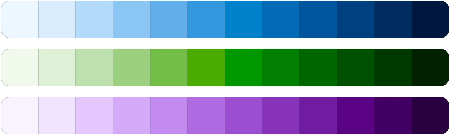
Additionally, our generator stands out by accommodating multiple colors within a single gradient, an advantage for working with challenging shades like yellow, which can lose appeal when darkened. Take a look at our approach to the yellow gradient palette:

Notice how the gradient transitions into red as it darkens, avoiding dull, brownish tones and instead, resulting in a set of colors that are a pleasing to the eye.
Our Journey to the Final Product
Before we reached the practical solution you see today we explored various other versions. Among these, we initially developed a tool designed to manipulate curves across lightness, chroma, and hue values.
While this method informed many elements of our final design, we faced significant challenges due to its reliance on functional curves. Achieving precise results or integrating multiple concrete colors into a single palette proved to be nearly impossible, making this approach impractical.
We hope that this tool is useful to you and will help you create wonderful colors in your next project.
Thanks for reading, and happy pausing!